

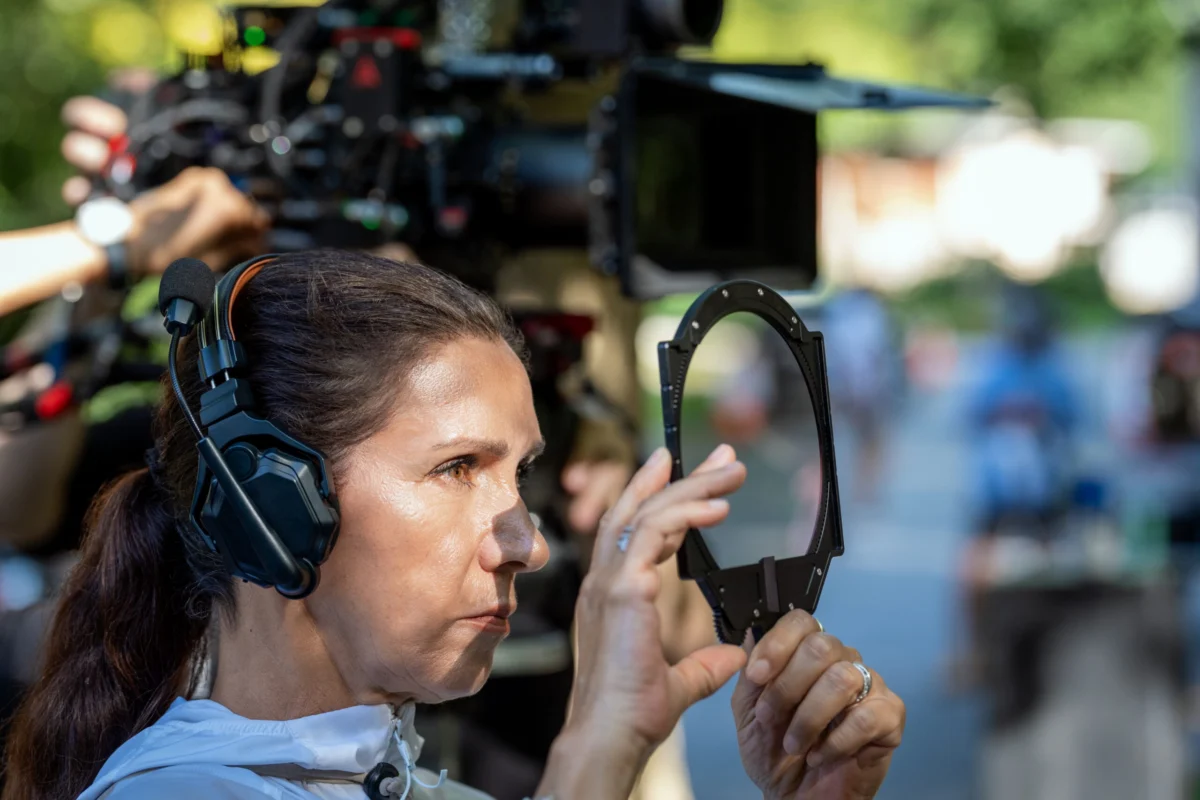
The psychological thriller Cape Fear has long served as a litmus test for cinematic intensity. From its origins as John D. MacDonald’s 1957 novel The Executioners to J. Lee Thompson’s 1962 noir classic and Martin Scorsese’s 1991 stylistic explosion, the story of Max Cady and the Bowden family is a cornerstone of the suspense genre. Now, Apple TV+ has undertaken the monumental task of translating this high-octane dread into a ten-episode prestige series. Under the creative direction of showrunner Nick Antosca and the lens of cinematographers Celiana Cárdenas and Eben Bolter, the new adaptation is making headlines not just for its narrative tension, but for a visual language that pushes the boundaries of modern television.
Main Facts: A New Standard for Televised Stylization
The Apple TV+ reimagining of Cape Fear arrives at a time when the "prestige TV" landscape is increasingly crowded. To stand out, series creator Nick Antosca—known for his work on The Act and Brand New Cherry Flavor—opted for a strategy of visual fearlessness. While most television dramas lean toward a consistent, safe "house style," Cape Fear embraces the experimental spirit of Martin Scorsese’s 1991 remake, which was famous for its dizzying array of whip-pans, Dutch angles, and aggressive camera movements.
The series is structured as a 10-part limited event, providing a much larger canvas than the two-hour films that preceded it. The central challenge for the production team was maintaining the "unceasing visual energy" of a Scorsese film across ten hours of content without exhausting the audience. To achieve this, the production utilized two alternating cinematographers, Celiana Cárdenas and Eben Bolter, who were tasked with developing a visual grammar that honors the franchise’s history while establishing a unique, evolving identity for the series.
Key to this new iteration is the casting and the expansion of the Bowden family’s internal lives. While the 1991 film focused heavily on the external threat of Robert De Niro’s Max Cady, the series delves deeper into the dysfunction of the Bowdens (played by a high-caliber ensemble including echoes of the roles originally inhabited by Nick Nolte, Jessica Lange, and Juliette Lewis). This shift in focus necessitates a camera that is as much a psychological observer as it is a witness to the thriller’s violence.
Chronology: From Noir Roots to Baroque Television
The evolution of Cape Fear reflects the broader history of American cinema and television. Understanding the visual choices of the new series requires a look back at the timeline of the property:

- 1957 – The Source Material: John D. MacDonald publishes The Executioners, a lean, mean thriller about a lawyer haunted by a man he sent to prison. The focus is on the morality of the law versus the primal instinct for survival.
- 1962 – The Noir Foundation: Director J. Lee Thompson brings the story to the screen with Gregory Peck and Robert Mitchum. The cinematography by Sam Leavitt is quintessential black-and-white noir—stark shadows, high contrast, and a sense of encroaching doom. It set the standard for the "man in the shadows" trope.
- 1991 – The Scorsese Explosion: Martin Scorsese remakes the film as a "Baroque" thriller. Working with cinematographer Freddie Francis, Scorsese used the film as an exercise in technical virtuosity. It was a sensory assault designed to mirror the psychotic breakdown of its characters. This version introduced the "whip-pan" and "accelerated zoom" techniques that defined the property for a generation.
- 2024/2025 – The Streaming Expansion: Apple TV+ and Nick Antosca envision Cape Fear as a long-form psychological study. The decision is made to maintain Scorsese’s visual ambition but to modulate it across ten episodes, allowing for "subjective" and "objective" shifts in perspective that a feature film cannot sustain.
Supporting Data: The Technical Architecture of Suspense
In a recent technical breakdown with IndieWire, cinematographer Celiana Cárdenas detailed the specific tools and techniques used to differentiate the series from its predecessors. The show’s "baseline" visual look was established using Atlas Mercury anamorphic lenses, which provide a classic, cinematic widescreen feel with an aspect ratio of 2.35:1.
However, the production team sought to break these rules during pivotal moments of character crisis. One of the most discussed sequences in the series involves a scene where Max Cady—or perhaps a more mysterious antagonist—spikes the Bowden family’s drinks with acid. To capture this "acid trip" without falling into the clichés of psychedelic cinema, Cárdenas and director Trey Edward Shults (known for his claustrophobic work on It Comes at Night and Waves) implemented a series of technical shifts:
- Lens Transition: The production swapped the modern Atlas Mercury lenses for vintage Super Baltars from the 1960s. These lenses are known for their "softer, dreamier" quality, providing a natural distortion that feels internal rather than digital.
- Aspect Ratio Shift: In a move rarely seen in television, the aspect ratio gradually shifts from the letterboxed 2.35:1 to a more vertically oriented frame. As the characters lose their grip on reality, the image begins to fill more of the viewer’s television screen, creating a subconscious feeling of "expansion" and "unsteadiness."
- Chromative Narrative: Cárdenas used lens flares to signal the characters’ rising "internal fever." This was tied to a narrative point regarding a broken air conditioning unit during a sweltering summer. The lighting transitions from cool blues and yellows to a suffocating, saturated orange as the sequence reaches its climax.
This data-driven approach to cinematography ensures that the visual style is not merely decorative but is intrinsically linked to the characters’ physiological and psychological states.
Official Responses: Insights from the Creative Team
The creative philosophy behind the series emphasizes a "subjective camera" approach. In interviews, Celiana Cárdenas highlighted the importance of tone and the relationship between the lens and the actor.
"What I love about the series is that each episode is different," Cárdenas told IndieWire. She noted that Nick Antosca’s expansion of the story allowed for a shifting perception of guilt and innocence. "Understanding the tone of each episode was important—where the characters are, and whether the camera should be objective or more subjective."

Cárdenas also emphasized that while technical precision is vital, it should never overshadow the performances. On the set of Cape Fear, the cinematography team worked to give the actors "360 degrees" of freedom. "How many movies have we seen where the camera can be a little out of focus, or the framing is not quite right, but it doesn’t matter because the performances are amazing? The performances and the story are the most important thing," she stated.
Director Trey Edward Shults reportedly pushed for these experimental flourishes, encouraging the DPs to find ways to illustrate "the feverish quality raging inside the characters’ heads." The consensus among the crew was that the audience should "feel" the visuals unconsciously rather than being distracted by them.
Implications: The Future of the High-Concept Series
The success of Cape Fear on Apple TV+ carries significant implications for the future of the streaming industry and the "remake" culture of Hollywood.
1. The Death of the "Standard" TV Look
For years, television was criticized for its "flat" lighting and predictable framing. Cape Fear joins the ranks of shows like Better Call Saul, Euphoria, and The Bear in proving that television audiences have an appetite for complex, experimental cinematography. By utilizing film-grade techniques like aspect ratio shifts and vintage glass, Apple TV+ is signaling that the line between "cinema" and "television" has effectively vanished.
2. The Viability of the "Mini-Series Remake"
There has often been skepticism regarding the need to turn two-hour movies into ten-hour series. Cape Fear provides a blueprint for how to do this correctly: by using the extra time not for "filler," but for a deeper psychological dive. The visual evolution described by Cárdenas—where each episode feels distinct—suggests that the long-form format can be used to explore the nuances of a story that a feature film simply has to rush through.

3. Subjective Storytelling as a Hook
In an era of "second-screen viewing," where audiences often look at their phones while watching TV, Cape Fear uses aggressive visual cues to demand attention. The use of lens flares to simulate heat and the shifting aspect ratio are designed to engage the viewer’s subconscious, making the viewing experience more immersive and less passive.
4. A New Chapter for the Antosca-Apple Partnership
The series solidifies Nick Antosca’s reputation as a master of the "uncomfortable" thriller. For Apple TV+, it adds another high-gloss, critically acclaimed title to a library that already includes Severance and Silo, further positioning the platform as the home for "elevated" genre content.
As Cape Fear continues its run, it stands as a testament to the power of visual storytelling. It honors the legacy of J. Lee Thompson and Martin Scorsese while carving out a terrifying, beautiful, and feverish path of its own. In the hands of Celiana Cárdenas and Eben Bolter, the camera is no longer just a recording device; it is a weapon of psychological warfare, ensuring that the legacy of Max Cady remains as haunting as ever.
 Jia Lissa
 Lina Irawan
 Iffa Jayyana
